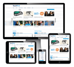
 Whether your company sells business to business or direct to consumers, chances are good that many of your clients or customers will access your website with their mobile phones and tablet devices. Optimizing your website for mobile use is vital now, but a complete website redesign may not be in your budget.
Here are three simple, low-cost ways to make your website mobile friendly:
1. Build your site with a tool that scales to mobile, or that can use a mobile-friendly plug-in.
If you haven’t already built your company’s website, you can make it easier to go mobile by choosing to build the site with a tool that makes it easy to go mobile. For example, the website-building tool Squarespace automatically creates a mobile version with every website design. If you’re using WordPress to build your website, or if you already have a site built with WordPress, you can easily choose a theme that senses the user’s screen size and adjusts accordingly. You can also add simple plug-ins to WordPress, such as WPTouch or WordPress Mobile Pack, which will automatically make your site mobile.
2. Use Cascading Style Sheets (CSS).
If you’re not using a simple site-building tool like WordPress or Squarespace, you can still set up your website to adjust for mobile devices by using external Cascading Style Sheets (CSS). These design tools tell browsers how to display your website’s content?what fonts and lettering sizes to use for each level of text, and what colors to use for each aspect of the design, for example. You (or the web designer you hire to build or update your site) can create a CSS specific to each of the most common mobile web browsers, and set each CSS to display the same content in a size and style that is optimized for mobile screen sizes and each browser. Using CSS means that you won’t need to spend money creating a separate website and creating different content for mobile users. Just teach your website to display the same content in mobile-friendly styles.
3. Simplify!
Look at the design and content of your site, and simplify everywhere you can. Make navigation simple and tappable. Keep in mind that websites load more slowly on mobile devices, so limit slow-loading elements like images and animations. Flash doesn’t work on Apple devices, like the extremely popular iPad or iPhone, so it pays to use HTML 5 or Javascript, instead, to show animations or videos. Finally, remember how difficult it is to enter text on a mobile device. Use forms on your website only when absolutely necessary.
Image Credit:
On Target Interactive